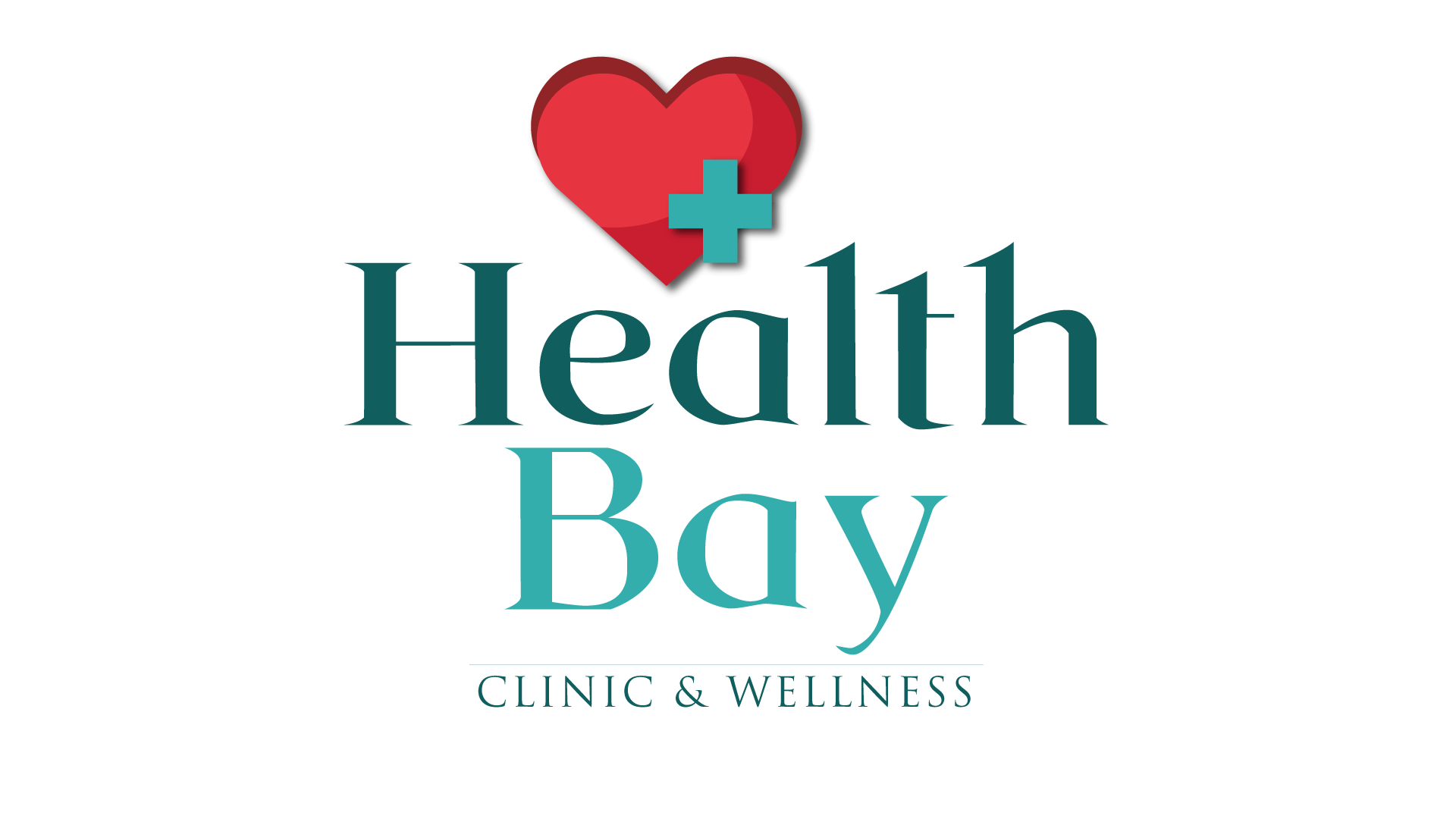
IMPACT: Unified branding across print and digital boosted the clinic’s visibility and trust in the community. In a collaboration with the clinic team, we created a dynamic, faith-centered identity for Divine Grace.
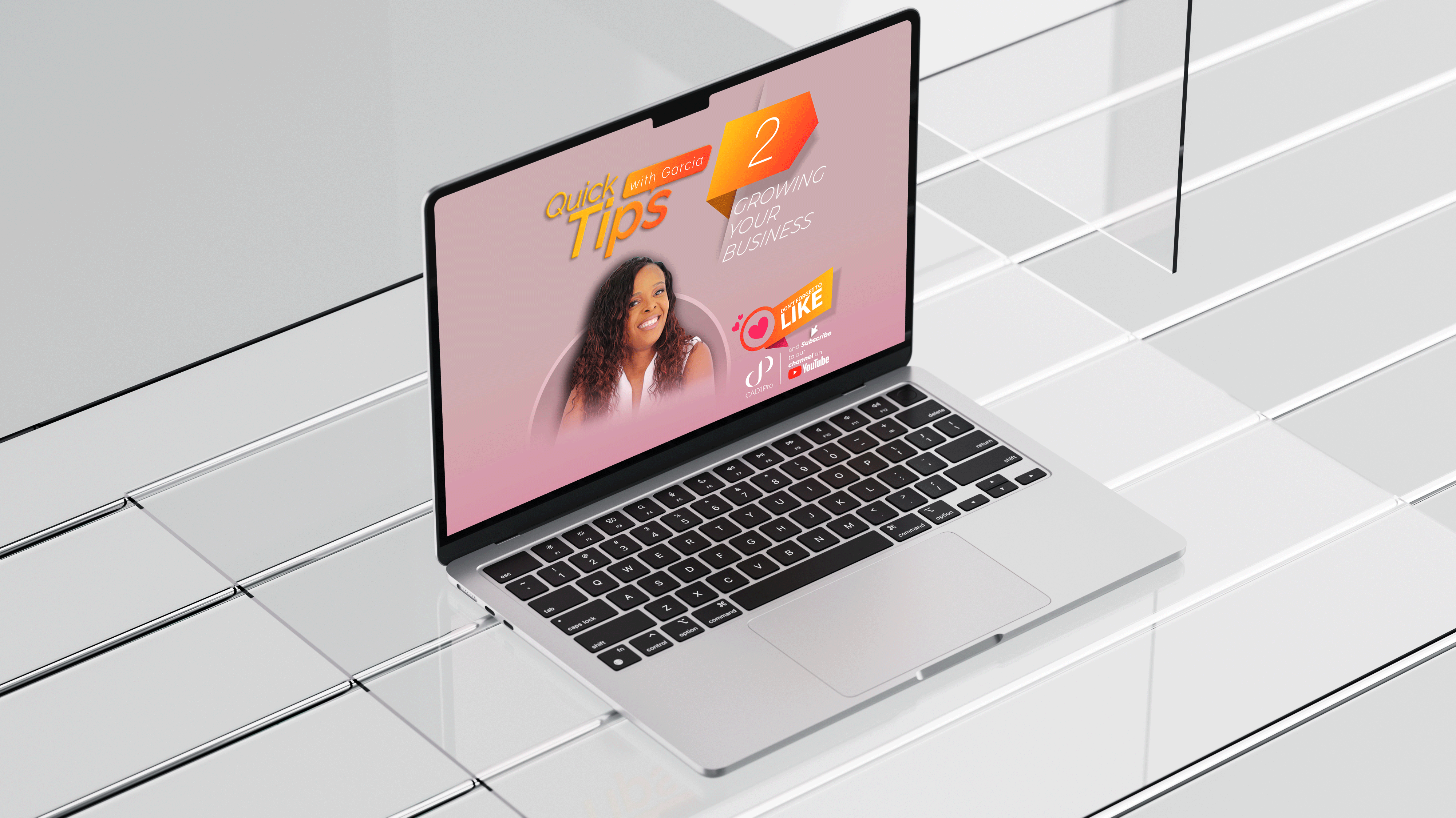
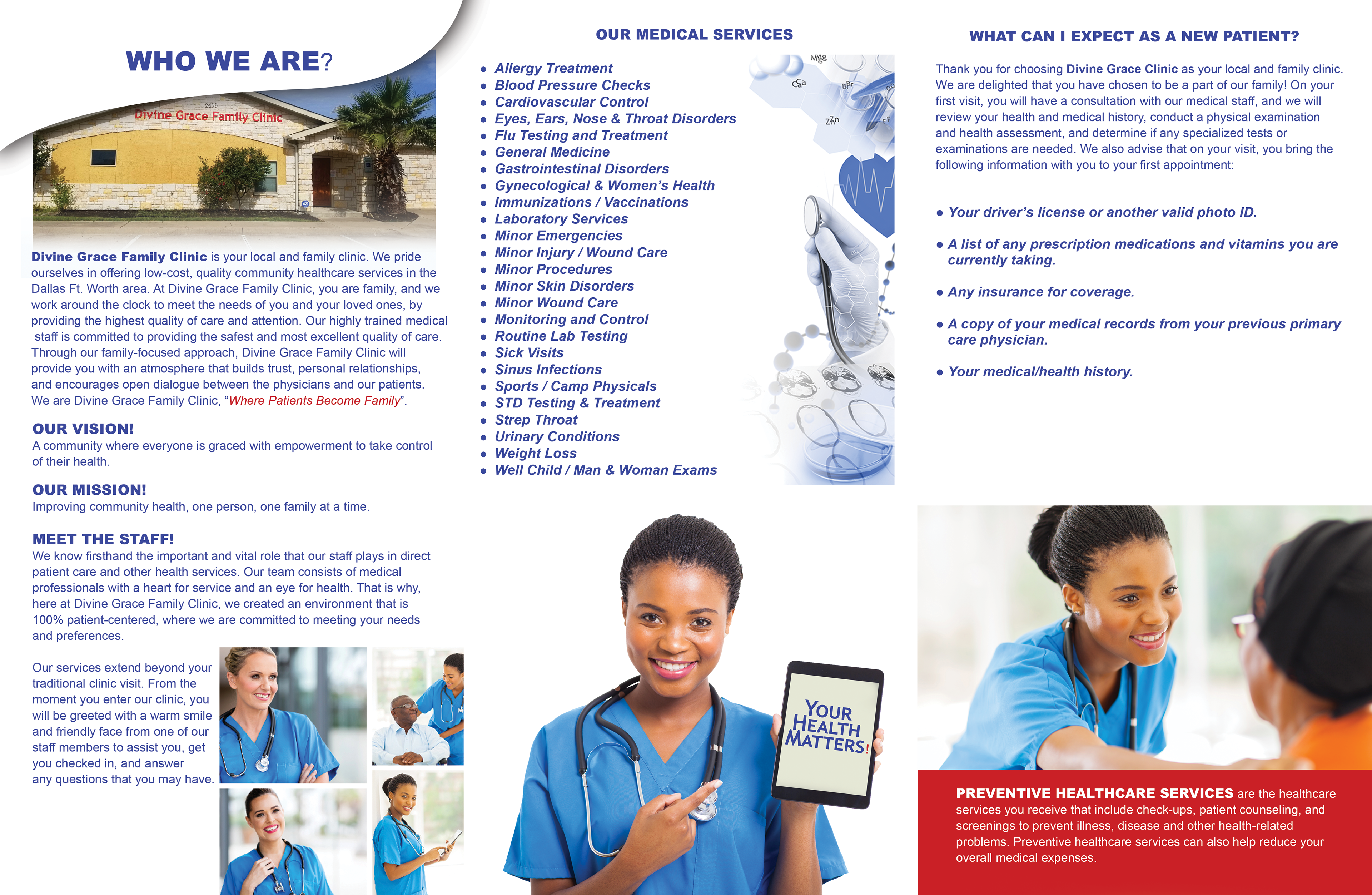
Deliverables included a warm, inviting logo and a visual system applied to print collateral (appointment cards, brochures, signage) and digital media (custom social graphics and short videos).
The new look balanced professionalism with compassion, echoing the clinic’s tagline “Where Patients Become Family,” while signaling modern, accessible care. Our multimedia branding solution unified the clinic’s presence, enhancing visibility and patient engagement.
Project Overview
‣ Client: Health Bay Clinic & Wellness.
‣ Role: Lead Designer.
‣ Services: Logo design, UX design, print collateral, social media templates, short-form video content.
‣ Tools: Adobe Illustrator, InDesign, Photoshop, Premiere Pro, and Hootsuite.
‣ Client: Health Bay Clinic & Wellness.
‣ Role: Lead Designer.
‣ Services: Logo design, UX design, print collateral, social media templates, short-form video content.
‣ Tools: Adobe Illustrator, InDesign, Photoshop, Premiere Pro, and Hootsuite.
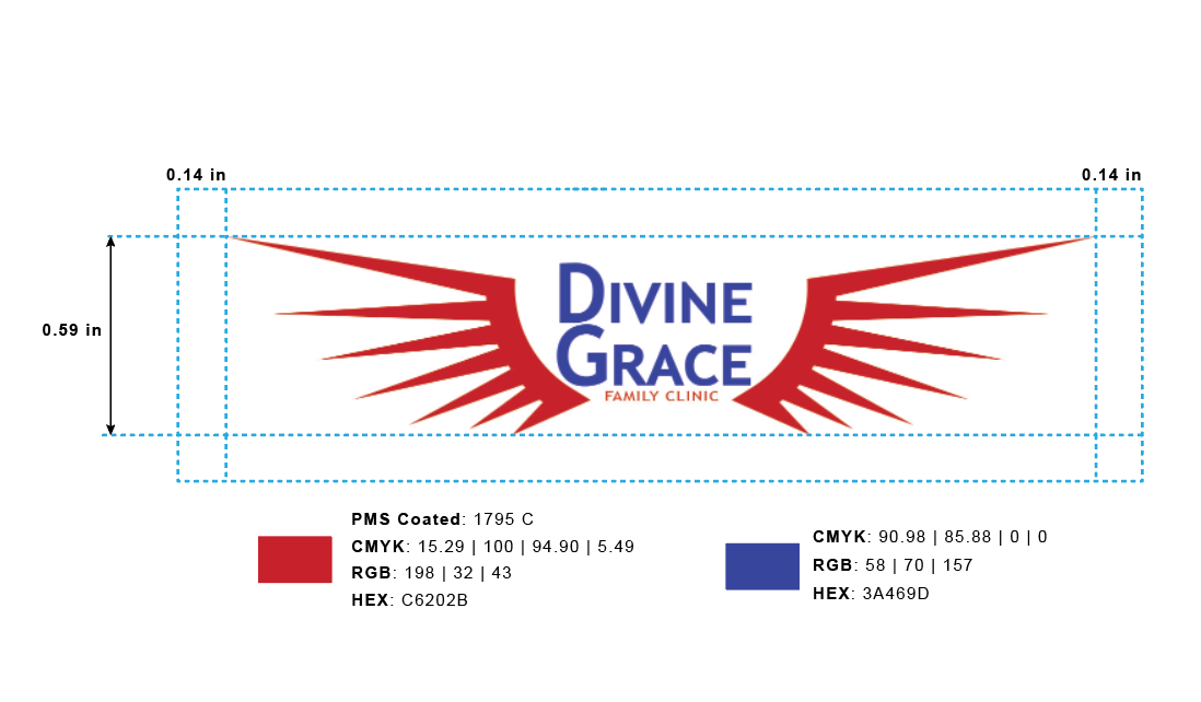
DESIGN CHOICES: Introduced a warm color palette and gentle iconography (e.g., subtle cross and family motifs) to convey compassion. Ensured all assets (from business cards to video thumbnails) share consistent typography and style.
Strategy: Emphasized consistency and precision in every element; for example, logo, signage, and social posts all reinforce the same brand values. We crafted video snippets (short clips) to engage younger audiences and extend the brand’s reach online.
Lesson: Uniform branding builds trust – designing for cross-platform consistency (print + digital) ensures a strong, unified brand message.
Design Process & Decisions
• Developed a warm, trust-centered color palette (sage, gold, and off-white) paired with a rounded sans-serif typeface to evoke calm and care.
• Designed scalable branding materials that maintained integrity across print, social, and video.
• Prioritized readability and visual consistency in every asset, including brochure layouts, signage, and online graphics.
Quick Stats
‣ 1,000+ new patients in Year 1.
‣ Branded materials spanned across 4+ media channels.
‣ 30% increase in visibility through community-based outreach.
‣ 1,000+ new patients in Year 1.
‣ Branded materials spanned across 4+ media channels.
‣ 30% increase in visibility through community-based outreach.
Key Outcomes & Lessons
‣ Cross-platform consistency strengthened community trust in the clinic’s services.
‣ Designing with empathy led to increased engagement and positive patient feedback.
‣ Creating a scalable brand system that gave the clinic tools to produce additional materials in-house.
‣ Cross-platform consistency strengthened community trust in the clinic’s services.
‣ Designing with empathy led to increased engagement and positive patient feedback.
‣ Creating a scalable brand system that gave the clinic tools to produce additional materials in-house.